Fuel Price Submissions
Fuel recording feature enhancement for Jeppeson ForeFlight
Role
Design Lead
Tools
Figma
Team
Product Manager, Engineer, Test Engineer
Problem
The information for fixed base operators (FBOs), or businesses that reside on at an airport, is available on ForeFlight in the airport tab. The information can be added by the FBO and then updated over time, either by the admin or - in the case of fuel prices - by pilots from within the app.
Despite this capability, the FBOs were having an issue with inaccurate or outdated information for their fuel. ForeFlight wanted to maintain their trusted relationship with customers by providing the most up to date information, despite the FBOs not always keeping their information up to date. The placement of the fuel button was an obvious first step but there was more to uncover.
UX Research
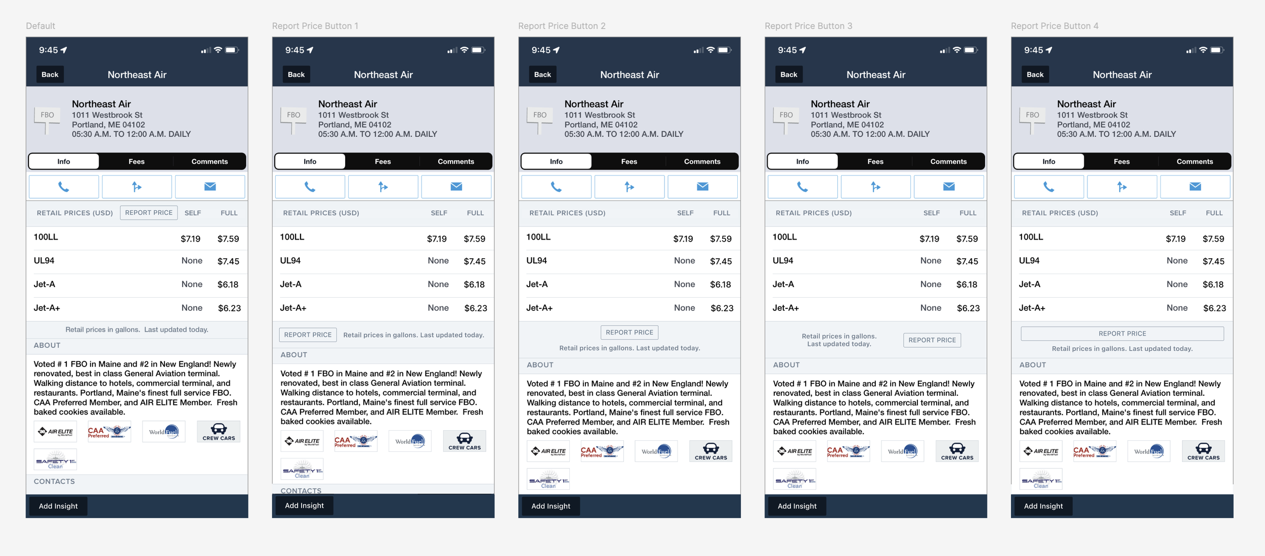
I began by gaining an understanding of the existing interface and what the issues specifically were, regarding that user experience. Based on the click data of the existing Update Fuel Price Button, I determined that the button required to update the prices was underutilized.
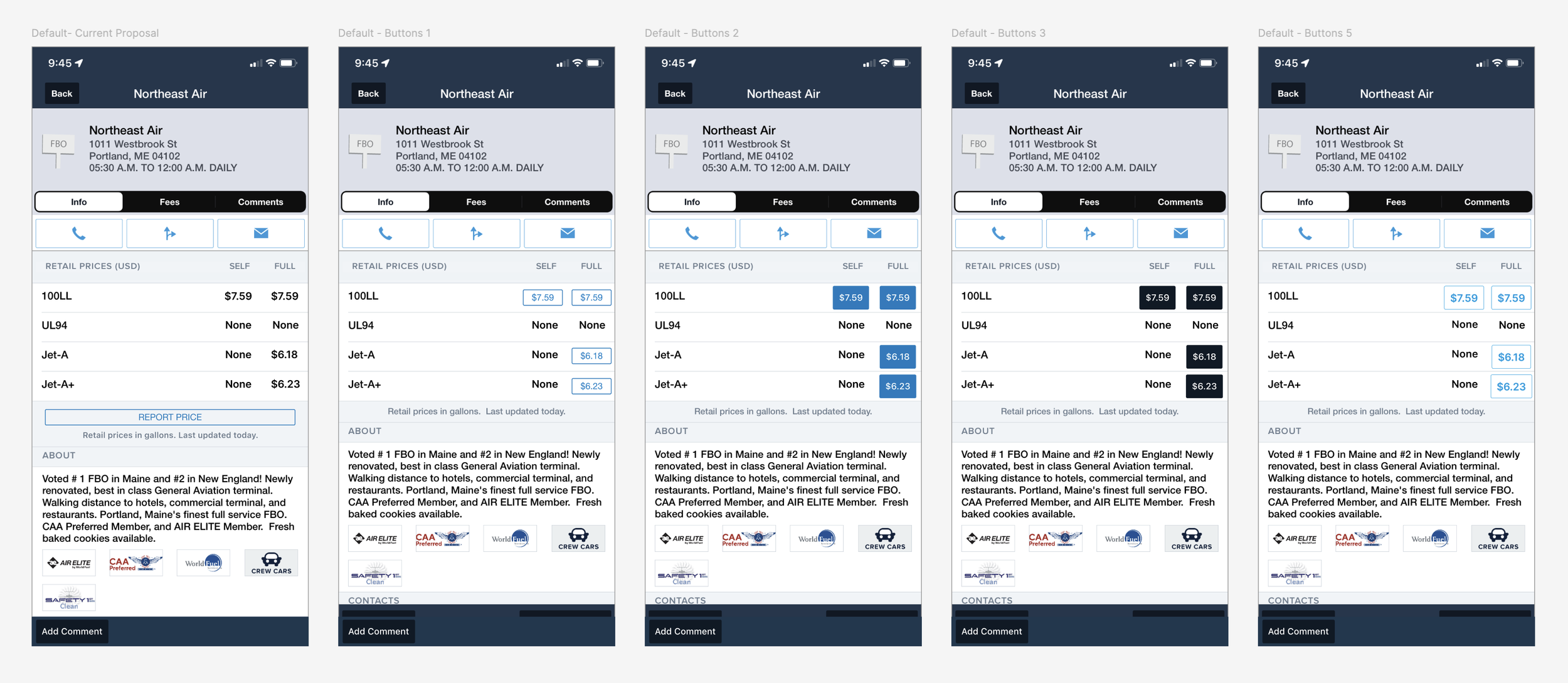
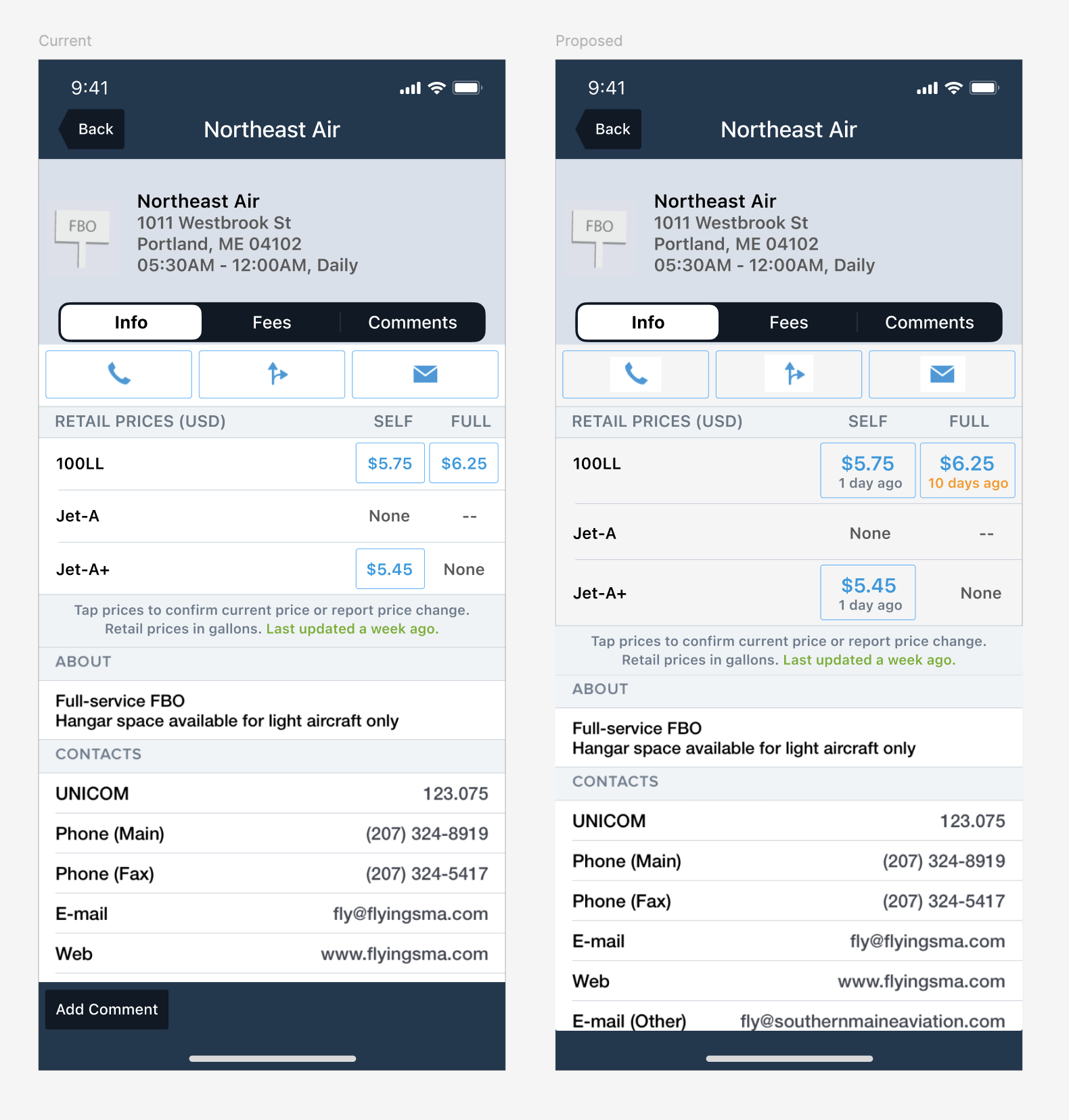
The objective became clear- in order to improve accuracy in prices, we would need to increase user engagement with the fuel update capability. This led me to explore the hierarchy. (See below)
Rapid Iteration & Prototyping
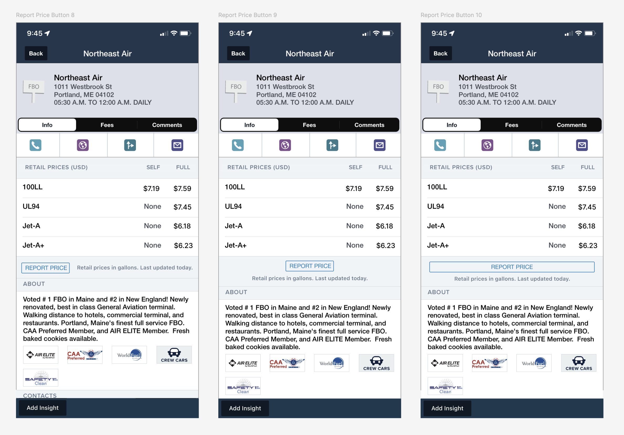
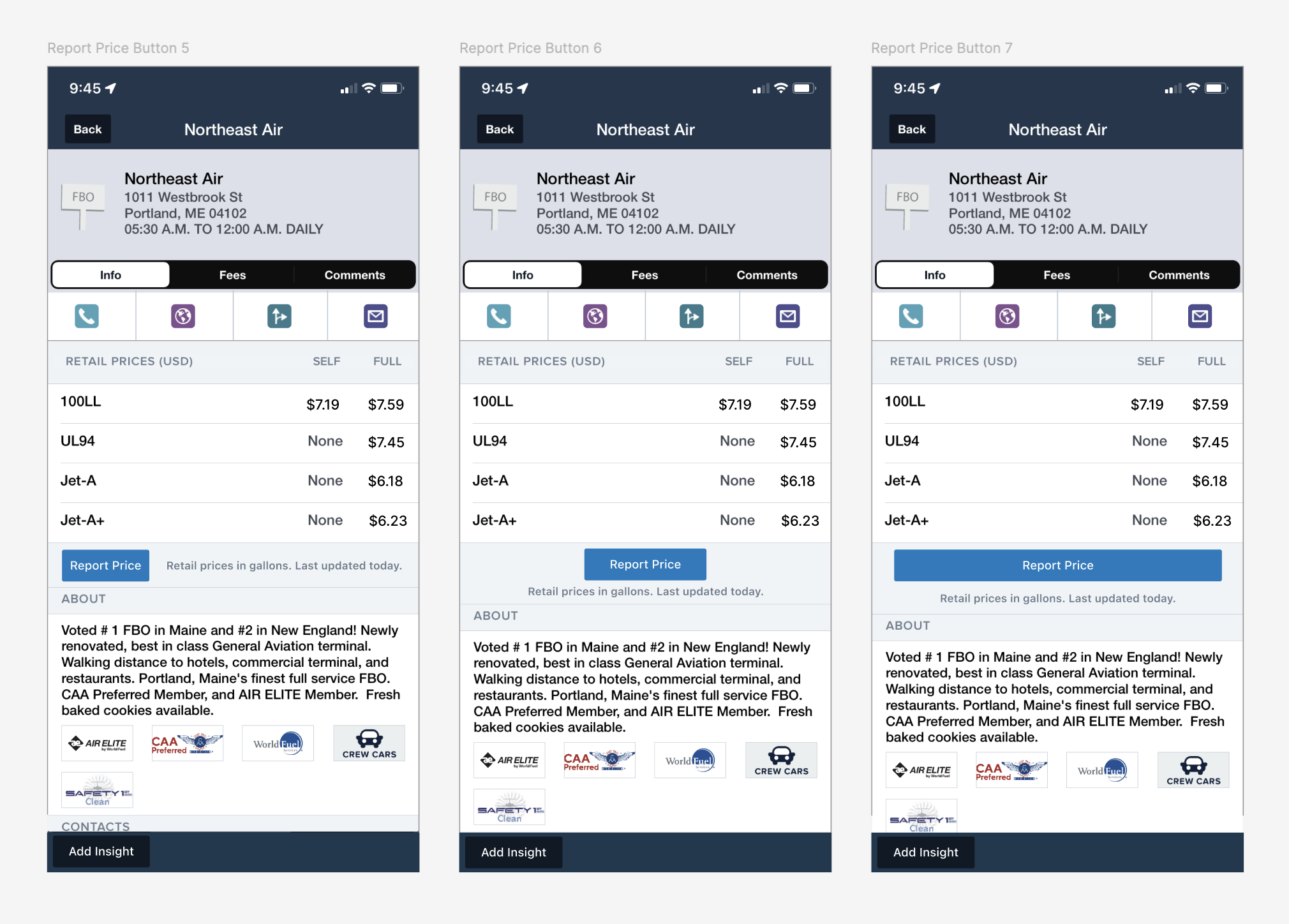
I put together many variations of button placement and tested those in prototypes with users.
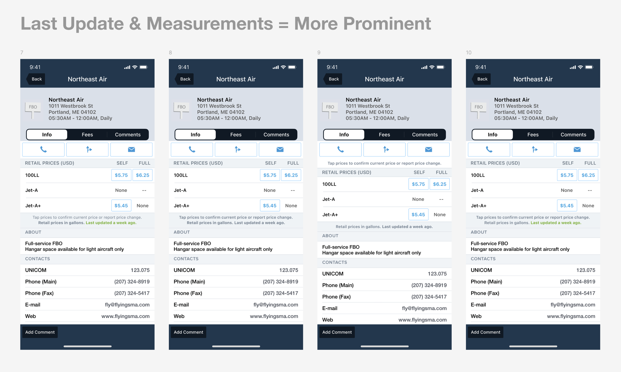
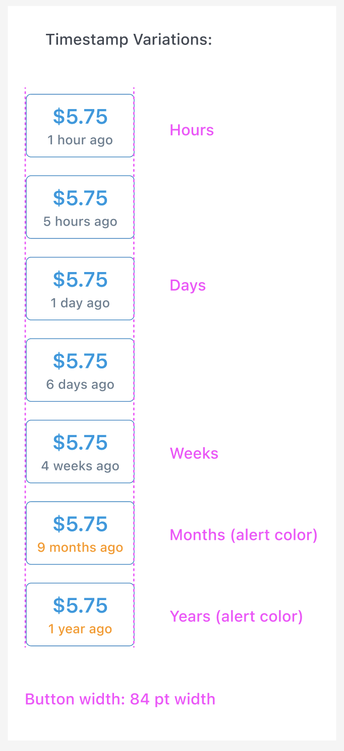
Another issue was uncovered. There was no way to differentiate a recent price from one that might not have ben updated for months and a single fuel price being off could cause concern about the rest of them being inaccurate, as well.
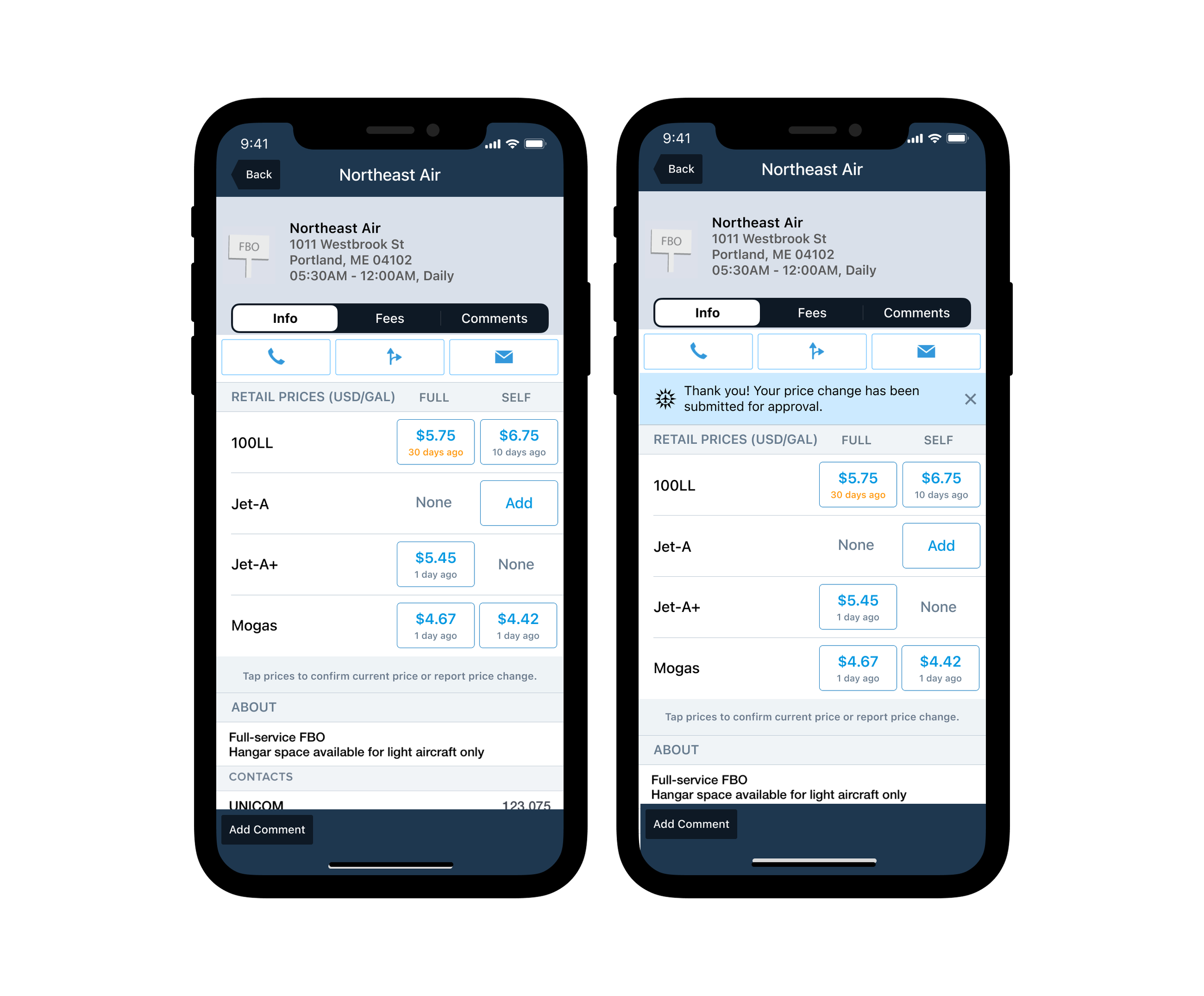
So I added a timestamp to the fuel prices, providing a level of validity to the timeliness of the data being displayed. While this surfaced freshness of the data, it brought back that level of trust that what was being shown was accurate and, in the case of the older data, we were showing the last time updated so that information would be used appropriately.
UI Design & User Testing
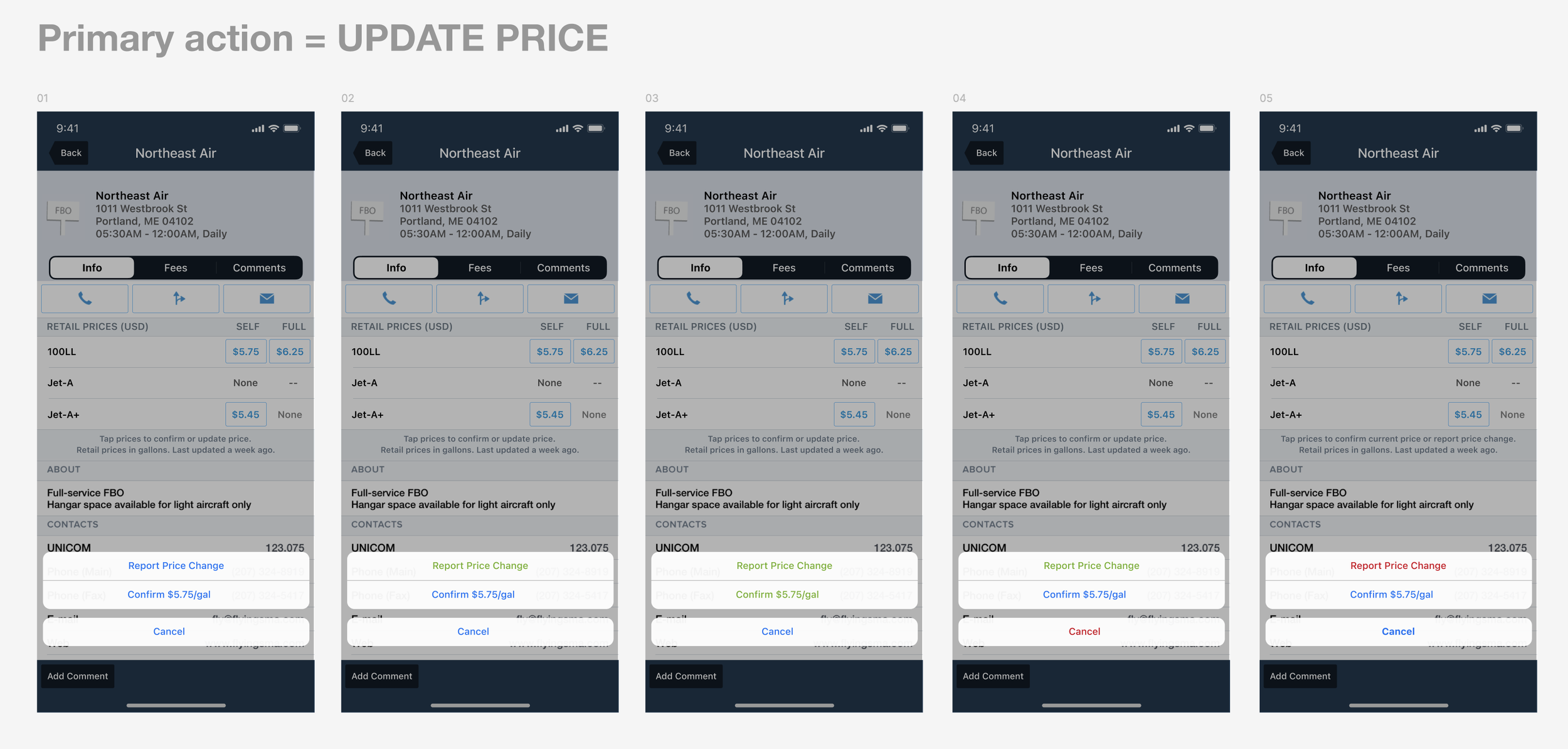
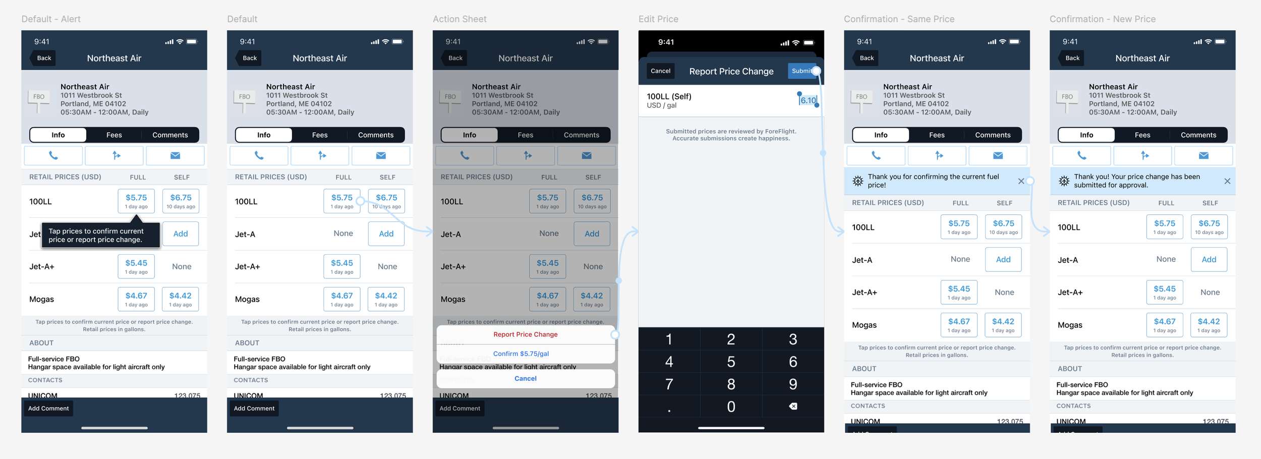
After coming up with several design iterations based on the product requirements, I put together user testing with pilots to understand which interface was the most effective and clear to them.
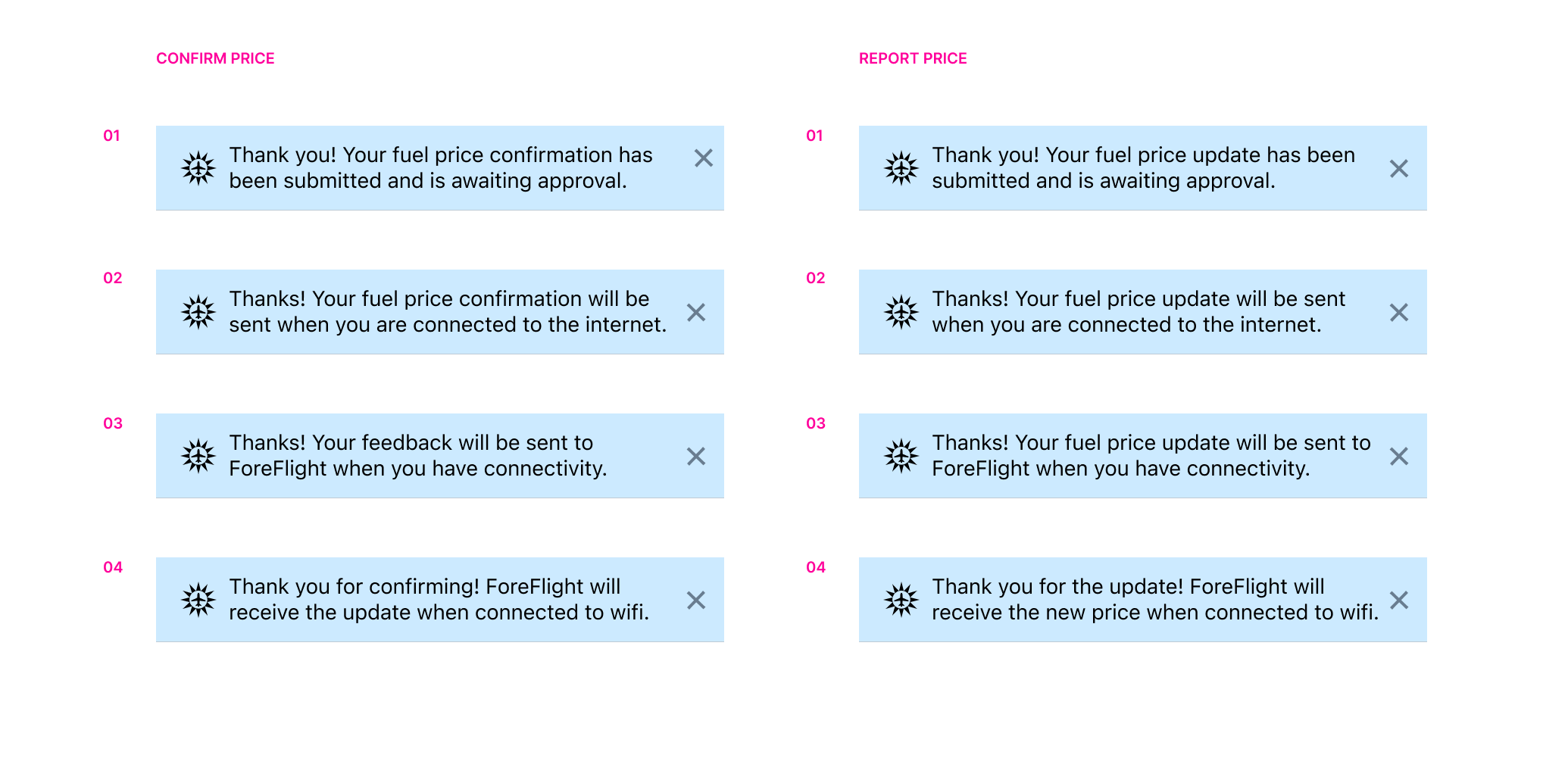
I revised the messaging around when the updated price would be displayed, since there was a delay and we needed it to be clear to the users that their new price had, in fact, been submitted.
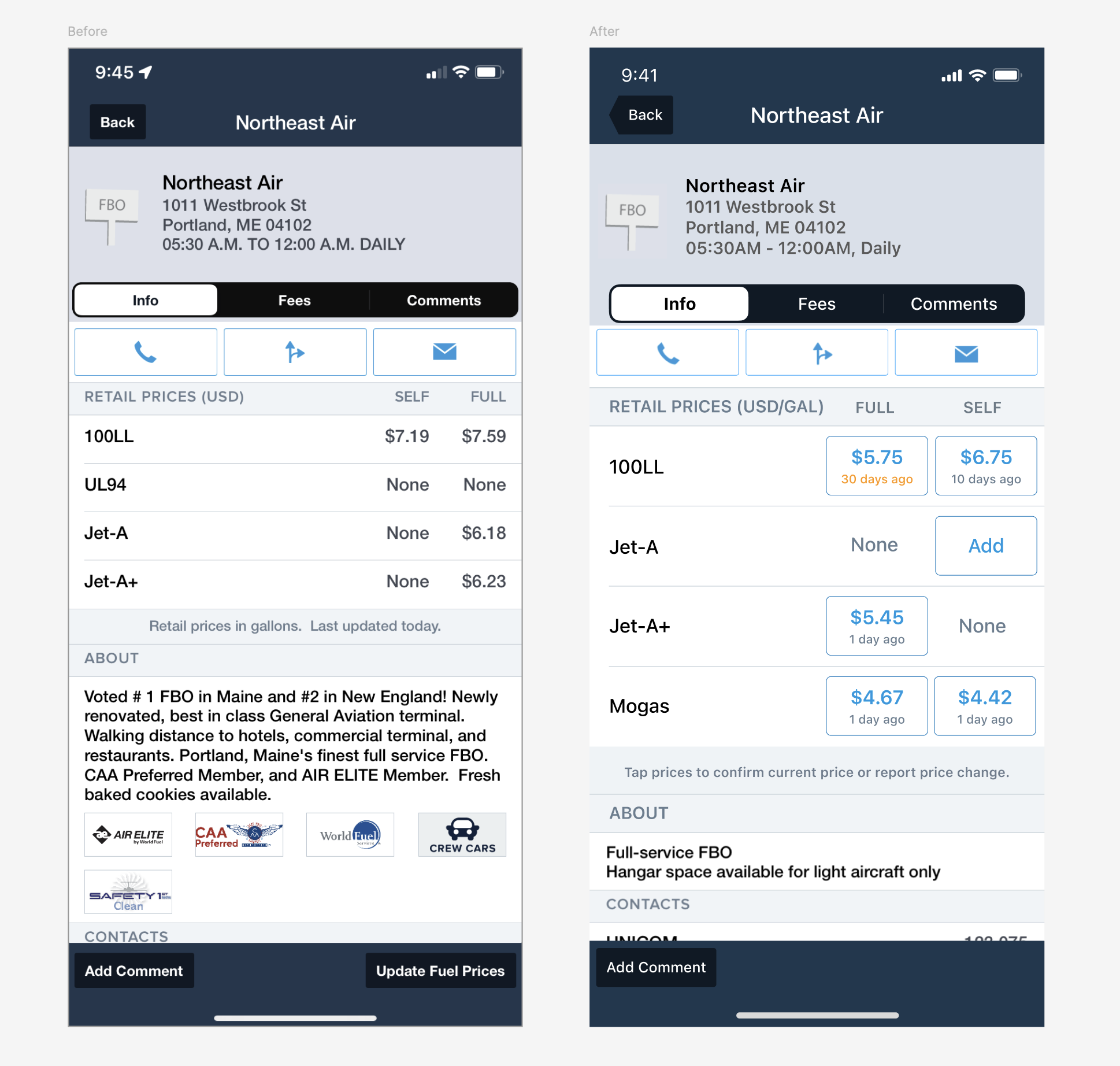
Result